My thesis work for the MFA program at the Savannah College of Art and Design.
Written by Jeremy Hlinak, 2024.
We need an anti-design movement. There has always been a distinction between Industrial Designers, Fashion Designers, Graphic Designers, Interior Designers, and more. Yet today, the title of ‘designer’ has seemed to impregnate itself into every industry without any thought process or delineation. As graphic design trends happened, graphic designers followed. As the executions of these trends became more popular, more of them appeared. As generative AI became popular, it compounded it all, and the world of efficiency and greed entered our sacred space. When we make something beautiful, and it’s apart from what the world around us is even possible of creating, we’ve made something to smell, touch, and feel deep within our souls. We’ve also made a choice to go alone. We’ll have to fight harder and constantly explain our rationale to a world that only wants to be the same. We’ll disagree with almost everyone, only allowing a select few to be a part of our microscopic world as we fight for our destinies as long-lost graphic designers: human beings who care about human connections, thought, and the ability to inspire someone else through our own unique voice.
The practice of graphic design has changed throughout its history, but not more than the past 40 years. With the explosion of technology and the introduction of the desktop computer in the1980s and 1990s, graphic design has seen innovations and reactive adaptations that have changed the industry. While technology has afforded us the luxury of speed, that luxury comes at the cost of quality in what we produce as designers. With different execution methods and the change in how graphic designers have produced work over the past few decades, the importance of a slow pace, analog materials, and hands-on graphic design in today's digital world is needed now more than ever.
It is difficult to determine when graphic design began. The cave paintings at Lascaux, from 15,000 BC, the Sumerians' tablets from 500 BC, the Rosetta Stone, the Book of Kells, and countless other examples are among the introductions of when humans began to put order and visuals to their ideas. Symbols stamped into clay and inked onto early paper dominated this craft for thousands of years. When William Addison Dwiggins first used the phrase “graphic design” in 1922, it would be easy to predict things would not change in the practice. A century later, this could not be further from the truth. Looking at the past, patterns emerge that dictate certain eras of graphic design. They begin to tell the story of change and where the future may be headed. We need an anti-design movement. There has always been a distinction between Industrial Designers, Fashion Designers, Graphic Designers, Interior Designers, and more. Yet today, the title of ‘designer’ has seemed to impregnate itself into every industry without any thought process or delineation. As graphic design trends happened, graphic designers followed. As the executions of these trends became more popular, more of them appeared. As generative AI became popular, it compounded it all, and the world of efficiency and greed entered our sacred space. When we make something beautiful, and it’s apart from what the world around us is even possible of creating, we’ve made something to smell, touch, and feel deep within our souls. We’ve also made a choice to go alone. We’ll have to fight harder and constantly explain our rationale to a world that only wants to be the same. We’ll disagree with almost everyone, only allowing a select few to be a part of our microscopic world as we fight for our destinies as long-lost graphic designers: human beings who care about human connections, thought, and the ability to inspire someone else through our own unique voice.
While the concept of ‘design’ became more mainstream during the Industrial Revolution, the period was more about social and economic growth – and an explosion of graphic design resulted from manufacturing, increased knowledge and literacy, and technological advances. The work of artisans diminished as capitalism grew because the existing way of creating solutions through craftsmen and their existing process did not match the speed of production. In addition to physical products, mass production gave birth to mass communication. Typography was first needed to accommodate the growth of books and other printed materials. However, the Industrial Revolution also saw the invention of photography and color lithography. These elements meant itwas an inventive time for graphic design as the era allowed for creative exploration because ofthe new processes, goods, materials, and public demand. The world now needed advertising and posters to be designed, and traditional typography did not suffice. Printers relied on typefoundries to provide new ideas and ways to express their communications through type. Vincent Figgins, Robert Thorne, and William Thorowgood brought bold, Egyptian, and fat-face type –where the contrast and weight were increased – to the masses. One of the most significant milestones of the Industrial Revolution was William Caslon IV's debut of a sans-serif typeface in 1816. This explosion of typefaces led to revolutions in printing, including the wood-type posterand Ottmar Mergenthaler's Linotype machine in 1886 (Meggs 127-129). Unfortunately, this time period also led to the mass production of many things designed, and the craft aesthetics of material goods declined.
Mass production led to tremendous growth in graphic design because of the influx of products, but the result was a world of mass-produced goods. A few designers who wanted to change this began a movement to put the emphasis back on the craft, care, and aesthetics of graphic design. A publisher named William Pickering worked with authors, designers, and printers to create beautiful pieces of work such as the Book of Common Prayer and The Elements of Euclid – which brought color and shape to educate the masses in geometry (Figure 1). Pickering and the writer John Ruskin began a revival in book design, treating books like limited-edition pieces of art as a reaction to the Industrial Revolution's moral, social, and artistic chaos (Meggs 162). One of the most well-known leaders of the Arts and Crafts Movement was a writer, philosopher, designer, and painter named William Morris. In the late 1800s, Morris wanted to ensure graphic design had a purpose and an individual expression of the designer. As the Industrial Revolution expanded, Morris became increasingly concerned that the period would result in drab, banal, manufactured goods. From buildings to bedding, Morris and Ruskin thought that a merger of art and craft could solve the world's problem of cheap, tacky products and allow workers to again find joy in their manmade environments. Botanical and other organic shapes made their way into the designs of textiles, furniture, and building ornaments. Morris hated the sterileness of offices and furniture of the time, and his designs introduced the public to intricate, nature-based options besides common mass-produced goods. While the Arts and Crafts movement flourished further when a young architect named Arthur Mackmurdo set up Hobby Horse – the first printed magazine devoted to the visual arts (Meggs 165) – Morris’s aesthetic is beautifully represented in the pages of The Works of Geoffrey Chaucer, from 1896 (Figure 2). In this example, we see the Arts and Crafts principles as graphic design through illustration, type, image, and composition.
As a result of designers’ involvement in the Industrial Revolution, and the artisan aesthetic of the Arts and Crafts movement, the world began to enjoy the products they designed. While they were produced quickly and inexpensively, they were also beautiful and functional for everyday life. These concepts carried over to the graphic design industry, and the need for order was crucial in the eyes of designers. Jan Tschichold – one of the design leaders of this era – created order for the printed piece by idealizing modern typography, proportions, and minimalistic form to the page's structure in his book The New Typography (Tschichold 64). However, Tschichold was not the first. The standardization of paper sizes dates back to 1786, but was adopted in Germany in 1922 as DIN 476 standard, commonly known as the A-Format today.
The Modernist movement brought stringent rules into this era of graphic design. According to some, Modernism was the counterbalance to a complex world, specifically the confusion around the commercial artist and the need for designers to establish rules based on clarity instead of artistic genius or concept (Müller 7). There were many ‘icons’ of the modernist movement in graphic design, including Armin Hoffman. In 1965, Hoffman authored Graphic Design Manual, which included the principles and practice of graphic design students byteaching them the basics of the profession in a constantly expanding and evolving world (Hoffman 35). Josef Müller-Brockmann wrote Grid Systems, which introduced the importance of layout and composition in the design education curriculum. Müller-Brockmann believed constructive design is capable of reproduction, was objective, and established design laws intopractical solutions (Müller-Brockmann 10). Arguably one of the most famous graphic designers, Paul Rand embraced the modernist principles set by Tschichold, El Lissitzky, Moholy-Nagy, and others before him. The New Typography inspired Rand to focus on modern graphic design wherehe began to prefer structure and order over handmade and ornament (Heller 22).
Massimo Vignelli, one of the modernist icons, referenced the next era in graphic design's chronology as “a disease” (Helvetica 55:01). Postmodernism challenged all the rules that the Modernists had established and practiced for decades. Flipping through the pages of any design history book featuring this decade tells of the change about to happen. In the 1980s, young designers were tired of the post-war rules of Modernism and rebelled against the notion that graphic design must be plain and ordinary. Joy came in trying something new (Müller 210). The field of graphic design changed forever with the introduction of the computer and the Internet. Designers April Greiman, Susan Kare, and Jeffy Keedy embraced this new technology while modernist masters slowly evolved to the inevitable adoption. Jens Müller, the author of numerous design books, argues that most designers were eager to move along with this massive change because change is embedded in the DNA of graphic design's culture (Müller 7). Designers like Paula Scher, David Carson, Rudy VanderLans, Rick Valicenti, and Vaughn Oliver embraced the lawless freedom of Postmodernism, creating beautiful, expressive, and unexplored work. However, Postmodernism didn't just rebel against Modernism for rebellion's sake. Instead, it introduced a new way of thinking – the ability to see multiple meanings of the same thing and put this control in the viewer's hands, not the hands of the designer.
Many people consider 1984 as one of two visions in their heads: a novel written by George Orwell where ‘Big Brother’ is constantly watching you on screen, or Steve Jobs appearing from the Heavens, flipping on the power button of a Macintosh and changing the course of graphic design history. The truth is there was a lot of experimentation before Jobs. Neville Brody, April Greiman, and others were pioneers of this moment and tried new things with the PC and dot matrix printer. In 1986, the concept of “The Death of Typography” meant that all the rules Tschichold had just written were about to collapse. As the designer Jon Wozencroft points out – using the letter ‘O’ as an example – letterforms were perfected over hundreds of years, and the letter ‘O’ digitally is not an ‘O’ at all. Rather, it is a bunch of squares stacked in a certain order to resemble an ‘O’ and thus became a different way of constructing typography (Brody 7). This concept may have subconsciously given designers an open door of possibilities, one that allowed experimentation because everything was new. Wozencroft stated, “The work, all of a sudden, was reinvigorated by the direct challenge to how we should understand visual language” (Brody 7). Brody, with his art direction, and Wozencroft, with his writing, created an experimental body of work in Fuse: a visual, interactive magazine that asked designers of the time to explore the possibilities – and definition – of digital typography. Designer and author Adrian Shaughnessy said about the two Fuse creators, “They demonstrated a new mastery of the digital tools and networks; they showed, more compellingly than ever before, how computerized design could be used to make a new future for visual and semantic communication that went beyond Roman letterforms and which species jumped from the printed page to the electronic screen” (Brody 12).
Digital media transformed from a read-only environment to one full of creator platforms. As a result, the opportunities for designers to share work became easier. As opposed to the days of mailing printed submissions to design annuals in the hopes of publication exposure to a group of other design professionals, publicity was now attainable. Through website builders, creative work could be uploaded and shown to billions of people in seconds by anyone. Over time, the number of online design resources grew, including the number of designers publishing work. This grew even further with the invention and adaptation of social media platforms. Students, practitioners, and clients did not need to make biweekly trips to the obscure bookstore to find new work. In the 21st century, design was everywhere. This created a saturated market of design that refreshed every few seconds as opposed to weeks. Some platforms allowed for the archive of digital work, while the permanence of digital design work was at the discretion of the author ordigital host. In addition to inconsistent practices for archiving work, editing and revisions were also a variable. Some digital spaces let designers revise and replace their work, while others did not. Authors, who no longer liked their own pieces, had the power to remove it. Alternatively, viewers had no way of knowing what work would remain and what work would be replaced. This constant refresh of content and vague structure of permanence was new to the design profession.
While the term ‘graphic design’ was widely used for decades, the phrase ‘web design’ was born in 1991 when the first web page went live (Web Design). After 70 years, there was a separation: two different roles with the same education and experience. Web designers did their own research and organized the content they were given. However, instead of this content being arranged on a piece of paper, it was all on a screen. In the early 2000s, this process was called “information architecture.” Regardless of this split, the original web designers were still graphic designers. The industry divided again when “user experience” came into play. While the same exercises as “information architecture,” the organization of content was given to a new profession made up of UX designers. With the birth of “UX,” the original web designers had their roles simplified and became “user interface designers.” At the same time, social media skyrocketed. The need for social media content and social media designers entered the design space. The rise of mobile devices and Internet speed also created a new medium with new goals. “User Experience” has been realigned to be purely about function instead of the subjective and emotional side of design. As a result, inspiration from the designer as the author – meaning work from their own voice – is almost invisible, and the digital products built by designers have become a platform for sharing content, rather than the content itself.
Defining a creative process is one of the most common questions given to creative practitioners, yet every interviewer needs to realize how pointless it is. There is no standard process because everyone is different, and that is the whole point of creativity. How can something creative have a process? Sometimes, it is sitting at a bar in a voyage of depression, taking a walk and looking up at the world around you, or sketching on a napkin. This question is typically asked by non-creatives who cannot understand these things and are uncomfortable with the ambiguity. The corporate world, however, does not work with ambiguity, and the “agile process” became the anti-anxiety remedy. Agile – the assignment of tasks into short bursts – put thinking, exploration, marination, and revisions into a perfectly time-boxed grid. It was a way for non-creatives to tell creatives to adhere to a structured system, and clients loved it. The result was work that was done instead of done well.
Another result of agile became a new definition of “design systems.” Previously, creatives had established “design systems” or “brand guidelines” to be adhered to by printers and other designers. They were creative rules that designers had set. Breaking them was the fault of others, and designers could call out the lack of professionalism by those who did not follow their guidelines. Technology changed this dynamic. Brand guidelines evolved into design systems, and designers were now required to provide only the basic building blocks for a developer to modify for screen sizes and responsive design.
The 21st century saw massive changes to production time. Early adopters of the MacIntosh computer praised a new medium and possibilities of experimentation, and designers like Neville Brody, April Greiman, and Susan Kare led this movement with groundbreaking work (Figure 3-5). But others focused less on the work itself and began to see the speed at which they could get their ideas out into the world. In the world of analog design, rapidograph pens, French curves, rubber cement, and Letraset type were some of the materials required to producework (Adams). This arduous process was about to be replaced in seconds. In the 1990s, designers could try something quickly, print out variations, and see how it looked in a fraction of the time it took for test prints a decade earlier. Speed allowed designers to try new things, move past mistakes, forget awful ideas, and make leaps of faith. Postmodernist designer Rick Valicenti remembers these days of experimentation, as he stated, “Experimentation during the ‘90s was made possible by just pure delight and curiosity in this new ownership of the profession; no longer will we be marking up pages of manuscripts and sending them overnight. Or I should say, to a typesetter who overnight would be able to keystroke everything and then send us back galleys in the morning for us to cut up and coat the back of it with rubber cement, lay it down on our illustration boards that we put crop marks on and bluelines and get it ready for press. This new technology was right there at our fingertips – as silly as that may sound – which afforded us the opportunity to make something come alive” (Valicenti). As digital design grew – specifically web, mobile, and social design – the concept of printing a proof for critique became less common. “Speed to publish” was a byproduct of this technological advancement. Designers met client deadlines easier, while the Internet and email allowed for the approval process to happen remotely and without the cost and challenges of shipping.
Producing graphic design has been relatively unchanged since the desktop computer became the preferred tool. The designer gets a brief and the work is mainly made on a compute rand sent to a printer or production shop. Depending on the job and their vision, it is up to the designer whether to use analog materials. Before the computer, however, time and materials dominated the production process. In the article “Graphic Design in the Pre-Digital Era,” authorPete Goddard describes every minuscule step required to complete the most basic tasks. It included sketches on paper, cutting out type by hand with X-Acto blades, Cow gum to adhere it to the page, enlargers to help composition, and film photography to shoot the ‘camera ready’ proof to the client. It was a daunting job with little room for error. Goddard points out, “Despite the health hazards and rampant insanity, there were some great things about this whole 'hands-on' process as you felt you had created something unique with your own hands” (Goddard).
Even with the experimentation of the computer in the 1990s, the designer printed their work. They made test prints to self-critique and final prints to celebrate their work. Printing was expensive. Proof after proof after proof was printed. Physical prints were held in the light, pinned up, and marked up. Pre-press versions had physical initials in the corner, indicating sign-off and approval to print. The final piece – when delivered from the printer – was a moment of magic. These were tangible artifacts, to live on, because humans could touch, feel, and smell the work. Whether a poster, vinyl album, or design book, the world held graphic design in their hands. When reflecting back with a modern view, this process was time intensive and costly, but the audience had something special. Some books were saved. Posters were ripped off public wallsand brought home. Today, original printed posters are collectors’ items, as are first editions, books, and out-of-print design magazines. At the time, however, this was the norm. Printing a design piece meant all that experimentation and hard work was worth it. It was the symbol of the design process; proof of ideation, revision, and finality. The printed piece was perfect and graphic design was forever.
We all make mistakes. In our personal and professional lives, we are far from perfect. Throughout history, there have been many imperfections crafted by creatives. Some have been deliberately made, such as the spirit lines sewn into the rugs created by Navajo, allowing apathway for the weaver's spirit to exit the rug (Figure 6). A similar practice was done in the rugsof the Amish and in the Punjab regions of Pakistan and India, as well as in the pottery and architecture of the Japanese concept of ‘Wabi Sabi’. Other imperfections were made from general education and the practice of learning a new trade. Artisans learned as they crafted, and today, the result of this exploration is seen in the work. Even in Islamic architecture, we can see examples of deliberate imperfection, as errors are evidence of humility, and the belief is that only God is perfect (Salon).
The early minting process of coins allowed for a different imperfection: neither deliberate nor failure. The sides of the coins were stamped by the human hand into a piece of hot metal between two molds. This process allowed for minor imperfections on each side. Varied human strength, misalignment, or the dullness of the mold created these tiny elements that made each coin a unique, one-of-a-kind piece. The Owl Coins of Athens are 2,500-year-old proof of human craftsmen (Sinopoli).
“The Portrait of Sylvette David” by Pablo Picasso has always intrigued me since I was a kid. Seeing the portrait on a screen or in a book is one thing, but I remember looking at all the details in person and noticed a few areas that always had me questioning the painter’s choices. The painting itself looks quickly done. While that is not a bad thing, I believe he changed his mind and was impatient about it. If you look closely at both hands, you will notice a faint, light-gray line going through both knuckles. This same line is in the head and in the negative space of the knee, and who knows what's going on with the side of the hair. As a painter, Picasso must have painted the structure of Sylvette in dark paint, but instead of waiting for the paint to dry, he covered it up, leaving a trace in the final piece (Figure 7). These imperfections are most noticeable in the hands: extending the length of the fingers on her left hand and covering up the line of her thigh through the right hand. It is difficult to define imperfections in art. As viewers, we are quick to establish paintings as derived from the perfection of the artist's hand. Without asking the artist directly, we can only assume. In this particular case, these faint lines are the mark of a human and the process to create a unique piece of art.
Imperfections are not only limited to something visual. In 1969, Merry Clayton recorded her famous vocals on the Rolling Stones’ “Gimmie Shelter.” And here we are, still talking about it. The story goes that the Stones called Clayton – their second pick – in the middle of the night to record some tracks for the song. Exhausted, pregnant, and in pajamas and hair curlers, Clayton showed up and recorded one of the most well-known backing tracks in rock history. What the listener hears is raw emotion. It is human energy, based on human lyrics, into an analog microphone recorded on physical tape. Clayton sings so intensely that her voice actually cracks. Now, 55 years later, we face the disaster of technology replacing this moment. There is no question that technology can replicate these notes and lyrics. But will those generated lyrics remain in our hearts in 2079? Or will the smoothness of flawless perfection make these notes forgettable (Merry)?
Imperfections are everywhere, and they remind us that we are not perfect. But they are also proof that we do not have to accept cold, sterile products of templated manufacturing. Imperfections give us, as humans, something human.
Why do we love to watch Keith Moon slamming his symbols during the promo video of Who are you? instead of listening to drum machines and their perfect rhythm? Why do car enthusiasts still search for manual transmissions and gasoline-powered V-8 engines – hearing the engine scream and manually operating the gear into place – instead of the mechanical fine-tuning of an automatic, electrified car? Why do we hope to pay a small fortune for a Michelin-rated restaurant instead of microwaving TV dinners? There is human joy in the long form; happiness comes from watching the outputs of human labor and the effort required to bring it to life.Industry has consistently made things easier for humans, yet we ride bicycles, go for walks, and read books instead of always opting to use cars or watch movies. Ideas can come from the time it takes to do nothing except be alone with our thoughts, and creativity is the output.
Beyond human connection, time is another characteristic required to make something of value and quality. Ask any passionate guitar player and they will bring up different luthiers andtheir handmade process. The world may know the Stratocasters and Les Pauls, but hidden amongst them are luthiers like Roger Bucknall in the UK and Isaac Jang in Hollywood who make almost everything by hand. Similar to how Antonio Stradivari built string instruments 500 years ago, theirs are considered some of the most sought-after guitars – known for the time, passion of the builders, and value of the final piece (Gluckin). Gordon Murray's obsessive attention to detail is well known in the automotive world, specifically his attention to detail as he designed and built one of the most desired automobiles: The McLaren F1. Almost entirely hand-built, the car took over four years to plan, and only 106 examples were built in its nine-year production (McQuilling). Savile Row in London is home to some of the most famous tailoring houses in the world, possibly none more iconic than Norton & Sons. As the world of autonomous apparel manufacturing evolved and moved to southeast Asian countries, bespoke suits can still be made the same handmade way at Norton & Sons as has been the case since 1821. With only ahandful of staff, suits can take up to 12 weeks to complete – much longer than running to the department store and buying one off the shelf (Carvell).
After 40 years, we talk about the “old way of graphic design” with a nostalgic tone, and go through each step of the process in detail – “just to create something a computer can do today in seconds” – as we wait for the amazement of a younger generation as they listen to our stories. What we forget to mention, though, is that this era of graphic design had a physicality to the work. You could smell the sometimes toxic materials used in the process and the ink that sat on top of the paper of which you could feel the tooth with your fingertips. There were headaches, scars, and burns. All of this work taught us something about design and ourselves. In the same way an apprentice learns the trade after years of mastery, graphic designers learned about composition, typography, and crafting a message through tangible materials, physical labor, and mental patience. Designers learned how to make the correct decisions because materials were expensive, and the thought process was based on experience. Throughout history, the concept of an ‘author’ has been debated from Roland Barthes to Walter Benjamin (Rock). In his piece, “TheWork of Art in the Age of Mechanical Reproduction”, Benjamin describes authority, authenticity, and aura (Benjamin). The type of work that requires human thought, physical materials, and time to explore is not easy to label. It is design that does not require a prompt, trend, template, or an efficient process. Is it ‘human’ design? Is it ‘real’ design? Or is it just ‘graphic design’ again? The profession has evolved since the 1990s to the point where roles and responsibilities are unclear.
In only 15 years, the graphic design profession had split into six segments, including graphic design, web design, print design, UX design, UI design, and social media design. Like frayed ends of a rope, the trade lost its solidarity and became weak, individual pieces that used to be part of something focused. The profession went from using critical thinking and understanding the audience and problem solving to one of task-oriented issues someone else assigned to designers. With the incorporation of design systems, the strategy of the creative output was not considered, rules were no longer concrete, and the concept of creative ownership changed from the designer to the developer. In less than two decades, designers had given up control of the output.
Digital media has introduced a new way of thinking, viewing, and designing, and, because of this, low-quality designs full of pixelation, lack of effort, and ubiquity are the result. Author Robert Pirsig spent 531 pages trying to define “quality” in his book Zen and the Art ofMotorcycle Maintenance. Half-a-century later, the word is still undefinable. It is a subjective term, and can be argued that ‘quality’ is up to the recipient as much as it is the designer. Regardless of who determines ‘quality’, the role of the digital designer has negatively affected quality in graphic design.
Today, we live in a world of function because of the demand for efficiency. As a result, our visual world has become dull. We have stopped expecting something beautiful around us, and have become complacent viewers and designers. When the Internet grew in popularity, the web design profession – derived from graphic designers – was creating beautiful visual designs for a desktop monitor. A software program called Adobe Flash was one of the main tools for making this work. While just a design tool, traditional print designers could elevate the message they built for clients through interactions, movement, and dynamic visual design. However, in 2010, Steve Jobs announced that Apple – whose wildly successful iPhone had changed how humans interact with content – would stop supporting designs built with this tool (Steve). It was not a slow adoption like movable type, the camera, or the Macintosh. This felt instant. A decade of phenomenal graphic design work – built for the screen – was now irrelevant. Designers who used the tool were dismissed as ancient luddites. Instead of being listened to or consulted, Apple lovers worldwide fell in line as a corporation – not the designers – made the rules. This is a contrast to the modernist movement, where designers guided corporations through production needs. Soon after, Google – one of the world's largest technology companies – introduced “Material Design” to the profession (Material). Material Design was a set of visual design guidelines for all web designers. Google recommended creating websites that were quick to load and easily searchable for people who used the world's most popular search engine: Google. Material Design was made of flat colors, sans-serif typography, geometric 90° shapes, and lacked ornamentation. The two largest technological dictators of the beginning of the new millennium wanted progress, and much like the Industrial Revolution, the pendulum swung – far – toward function. Form was a distant memory. This pendulum debate of function versus form further widened with another technological giant in Adobe. Adobe has helped creatives experiment and simplify remedial tasks through their software. Their programs were built for designers with the education, patience, and creative vision to make something beautiful. However, around 2015, Adobe started investing in easy-to-use programs, templates for non-designers, and generative artificial intelligence (Adobe Express). This era of function in digital software is different from the Industrial Revolution. It is even different than the Postmodernism movement. In both periods, designers spoke up against a narrow focus on only function. Designers of those eras craved form. Designers wanted to build something beautiful. These designers created movements to bring creativity back to the profession of creatives after normalcy entered their worlds. In the first quarter of the 21st century, designers sacrificed form in favor of function and relinquished control of the medium to the developers through the creation of design systems.
Since the Internet began, the average connection speed has grown from 14 kilobytes to 100 megabytes a second – a 7,143 percent increase. The quality of the content has suffered as the world adapted to a faster Internet connection. This concept of speed is the antonym to a slow pace. The industry – and the viewer – has rewarded content that can get delivered quickly, thus, design has become a mechanism for that lightning-fast connection. In other words, designers changed the way they design. Instead of a unique voice and visual point of view that draws the user in to absorb the content, designers make work to be delivered at lightning pace by compressing their work into the lowest possible quality. Designers succumbed to this normalcy and didn't take a personal stance against it.
This loss of quality represented in quick, templatized work is not only seen in the design of the screen's content or how fast it gets delivered to the screen, but also the screen itself. In the beginning era of digital design, viewers had been used to 300dpi, four-color printing on beautiful paper they could feel and smell. The first desktop monitors brought visual design through a standard 4:3 aspect ratio, square pixels, and red, green, and blue lamps. Unlike print design –where designers and printers helped bring the best quality to the masses – digital design had to ‘fit’ within the parameters of existing technology. Over time, lamps got old, and the quality of design suffered because the need was not the same as with printed pieces. This new medium has eliminated the need for press checks, paper samples, and Pantone swatches. The limitations of low-resolution screens became a design issue. Designers no longer had to make elements perfect because no one could see the imperfections anyway. To make matters worse, the rise of mobile devices has transformed the screen from something the size of an A1 or A2 sheet of paper to abattery-powered A7
In the early 21st century, digital applications allow us to absorb content as quickly aspossible, even without our conscious thought. On our digital devices, our thumb scrolls through the content on the screen. However, scrolling eliminates the time it takes to critique as a viewer. We ‘like’ instantly, without spending the time to actually evaluate why we ‘like’ it. We miss the nuances of concept, alignment, color theory, or typography and its hierarchy, and the human connection to the creator. Instead, we have been trained to either ‘like’ or move on. Both decisions give the false sense of success or failure to the designer. But what if what we see on screen was printed instead? What if this same work was physically permanent? We are so eager to share, but we do not question if we should. Just as digital and scrolling inhibits us to critique work as viewers, these same habits inhibit ourselves from the self-critique as sharers. The method of printing work forced a final design, given its costly nature. These final designs were printed, framed, and hung – or sent to a publication to make press time. As the world evolved, these final moments diminished, and the next ‘final’ came more and more rapidly. In the first few years of the Internet, digital audiences were waiting for content. They refreshed until something new came along. Only 20 years later, the story shifted to one of content overload and the impacts on mental health (Abako). Instead of waiting for content, the content does not stop coming. The digital population is constantly force-fed content, resulting in the lack of time to even absorb what we are seeing beyond a few seconds. The idea of finality almost evaporated. Billboards on the highway and the bombardment of advertising is a similar experience. The ubiquity of mediocre graphic design has resulted in a medium we drive, turn, and scroll past. Designers are the first step. We have the ability to judge because of our trained eyes, education, and experience.The solution is to stop, wait, look, evaluate, and critique. This is in the hands of designers. By making quality work people want to find, designers provide value. Anything less should not meet our approval. Instead, it is just a ‘like’ or a meaningless heart icon in an era surrounded by other meaningless icons.
Author Malcom McCullough stated in his book Abstracting Craft, “We have reached apoint in the history of technology where it is especially important to take pride in human abilities” (McCullough 19). McCullough is speaking about the general ubiquity that technology provides, however it is not so easy to define human ability. Use of the hand, perfection of the hand, or even – imperfections. Imperfections are proof of the human (Horsham). In the art world, imperfection is a silent record of the designer, artisan, craftsman, musician, and others who built an idea with their own hands. As the corporate culture of efficiency and mechanical reproduction continues to flourish, imperfections are not as visible as they once were. Yes, machines fail, materials get old, friction makes things worn, and the elements affect anything built to perfection. But these moments of failure are different than those of imperfection. When our machines fail, they irritate us. We get mad at the manufacturer of the item we purchased. When we purchase an item with human imperfections, it is special. There is only one, and it is ours.
The rise of digital made it possible to create design work faster, and the corporate world could not be happier. Companies began to promote their own unique process and try to give a formula for creativity. One of the most popular is “Design Thinking.” Created by David Kelly at Stanford’s d School, and brought into the mainstream by firms like IDEO, Design Thinking followed a strict, five-step process to solve design problems. But in her lecture, “Design Thinking is Bullshit,” Pentagram partner Natasha Jenn argues that this process leaves out time for the critique (Natasha Jenn 2:52). Designers’ own critical eye for evaluating work was replaced by testing in focus groups. There are multiple problems with this method. First, it is human nature to like what we have seen before; familiarity is comfortable. Second, those who were making the final decision – usually the ones controlling the budget – were now listening to the participants of the focus groups (who were sometimes financially incentivized), instead of the trained designer, who had used research, education, and experience to solve the design problem. These new problem-solving methods mixed with the agile production process changed design to be about efficiency. Graphic design is all about the communication of information. Graphic design is also beautiful, inspirational, and memorable. Sometimes this process is not systematic or efficient at all, and that is a wonderful thing.
The generalized “Is faster...better?” debate has been argued by designers and clients for decades, and recent graphic design is no different. With the advent of the computer, template companies, and generative AI, in 2023, “time to completion” is a metric that is continuously lowered. But is the work actually “better?” Crowd-sourced freelance companies like Fiverr allow graphic design briefs to be shopped around for the lowest – and quickest – bidder. A recent experiment on one of these platforms asked six designers all over the world to create a logotype of the word “Francis” using only generative artificial intelligence (Figure 8). Each of the six logos cost $7.78 USD and took an average of 12 hours to complete, in contrast to Paula Scher's Citi logo – and her famous “sketch on a napkin” process – which cost $1.5 million to design (Kury). While Scher is arguably one of the most successful designers, and Citi – a global leader in finance – is well-known and established, will clients of the future care? In Caps Lock, author Ruben Pater asks, “The question is for how long designers can keep their hourly rates, if the same services can be bought for a fraction of the price?” (Pater 310). The Society of Typographic Arts mentioned that Montserrat is 2023's “Font of the Year” as determined by Fiverr (Font). It iseasy to see why as it is a free alternative to the popular Gotham typeface designed by Tobias Frere-Jones. Designers could make modern logotypes in the style of Gotham without paying for any licenses. This acknowledgment by an inexpensive graphic design marketplace is how the “do it cheaper” request enters the industry. Clients have an immediate counter-bid because of companies like these. “Faster” is not a clear term because its definition is a variable. Still, it isclear to any graphic designer with minimal experience that clients do not like to wait. “Better” is also a subjective descriptor, with personal opinions contributing to its definition. Faster, in a lot of ways, is a detriment to quality, because the clients’ need to adhere to a formalized process can eliminate the time for exploration, critique, and revisions. “Faster and better” is not the best representation of technology’s impact in graphic design today. A more accurate phrase for the first quarter of this century may be “easier and good enough.” But too much of a good thing has its downside. Speed to content becomes a necessity. We seek out our addiction because we crave it and we need it injected into our bloodstream. This addiction makes our past foggy and changes us. When we change, we abandon our past. We used to take our time. Time gave us the ability to think before we execute. In graphic design before the computer, we planned things out because materials were expensive and the process of using them took time. The removal of time leads to designing what we know has already worked in the past. Therefore, we replicate. Designer Aaron Draplin refers to this as “cheap” and “phoned in” (Draplin). It is lazy graphic design. We never question why clients need to do things so quickly. When we rush, we repeat to avoid mistakes, and mediocrity is delivered into the world through the anxiety of deadline-induced stress. This situation is ripe for automation and generation, removing human thought. Human thought and a personal voice result in a unique design that moves forward the art world and our clients' needs. Speed to finish a design has also eliminated a more subjective side of graphic design: the joy of making.
In the early 20th century, the Dadaists fought the world around them. They rejected normalcy to extreme measures and revolted against the First World War, and applied that same revolution against the conventional art surrounding them (Davis 111). While serious topics, the Dadaists still had fun. From performance art to urinals, any viewer – who understands the movement – can feel this joy. Today, joy is harder to come by. Designers with a unique voice do not fit in. Going against the grain is not accepted. Today's world shoves these perspectives into an obscure box and chastises the argument for anything different than normalcy. The world does not understand that these obscure designers want to make something that others also enjoy. It is not just about them. It is about the joy of putting something beautiful out into the world. Designers of today are bombarded with new technological advances, specifically with automation. As they are expected to embrace these new features that will make their jobs faster, missing is the evil overlords' repercussions: they are removing joy from the day. Designers like making work. Designers enjoy spending hours generating ideas themselves. This is time devoted to their craft. Time that proves designers are talented. It is time that makes them happy. Why would they willingly give this up? There is joy in spending time making and building things. Sweat equity equals pride and the confidence that what was built will last because of the time spent to make it. At the Adobe Max design conference in Los Angeles, 2023, audience members listened to Danielle Morimoto, Sr. Design Manager at Adobe, explaining how their new generative AI software could replicate her own illustration work, in seconds (Morimoto). Morimoto – and the audience – applauded in positive amazement after each rapid automatic generation. But the joy designers have while creating the work was never mentioned at the conference. Instead, the message was promoting new software, without the realization that her own unique voice was just replicated, and their joy in creating the work was now deemed inefficient. If it can happen to a speaker onstage in front of thousands of creatives at one of the most popular conferences in the country, why can’t it happen to any designer? To make matters worse, this was a recurring theme of the Adobe conference – the leading conference of creativity, and exacerbated by a one-sided version of this technology, delivered on stage to thousands, and then online to millions.
Artisans, craftsmen, sculpture artists, painters, musicians, poets, and graphic designers love making work. They clear their schedules, turn on some music, and create beautiful work. This is a sacred time for creative souls who want to escape the world of normalcy. The planet does not reward happiness in humans, specifically happiness in the workplace. Instead, it rewards efficiency. But the corporate world is not as intelligent as you may think. The corporate world cannot understand that joy in creating work results in better work. Time to build the work, and the joy in making it results in quality.
The argument for good graphic design is fair and well-intentioned. The audience and clients, however, need to be part of that conversation. In a capitalistic society full of stress andobligation, aesthetics, effort, and personalization are a lower priority. Audiences today want the instant content and the familiarity of what they have seen before. They are used to the pop music aesthetics of templates and mass-produced graphic design. At the same time, those who make the decisions must be willing to fight for more meaningful and personalized executions. In this same world of stress and obligation, are decision-makers ready to add the additional challenges of getting their peers' approval? Is it easier to propose what has been accepted before – or begin an uphill battle of internal logistics for something where there may not be an audience who cares? In the article “The Age of Average,” author Alex Murrell discusses why everything looks thesame. From cars to cities to people, the public prefers what they have seen before (Murrell). In the case of the United States’ “five-over-one” residential buildings (Figure 9), Murrell cited Coby Lefkowitz's essay, which mentioned four reasons for the similarity: the restraint of building codes, rising land costs, rising barriers to entry for new developers, and developers looking to reduce their costs. In other words, when faced with many challenges, it is easier to do what hasbeen done – and approved – before. If approval boards accept the predictable design of a brand-new luxury automobile or multi-million dollar housing complex, why would they push fora custom piece of graphic design – especially if the profession has already dipped its toe in the water of templatization?
If the future follows the past, the next step for the graphic design profession could be to become a mass produced, digital one. Other industries have been subject to significant change or extinction. In the late 19th century, electricity replaced the lamplighter. A century later, the Internet replaced the phone book. In the early 2000s, the travel agency profession began its steady decline with the rise of websites like Expedia and Priceline (Allard). Streaming movies ended the video rental business, and, only a few years later, ride-sharing applications changed the centuries-old taxicab industry. Technology can impact the way we do things. Sometimes, it makes things better, and sometimes worse. Either way, technological advances will continue to come and evolve how humans interact with the world, and graphic design as it is known today will be part of this evolution.
From the affordance of making things to the ease of exposure, this digital world has given. the profession some advantages.
We can quickly experiment. In the past, experimentation required time, materials, and money. In the first quarter of the 21st century, the process was simpler. Designers did not require physical materials to get the job done – the use of analog materials is completely at the discretion of the designer. Designers did not need to wait for a proof to come back from the printer or paper samples to arrive in the mail. While this could also be a detriment, today designers can begin their work in seconds on a computer. The more we make and see, the more we learn. This era was no different. Technology and digital afforded this, and the idea of a select group of AIGA or AGI masters meeting in secret across oceans was now accessible to anyone, anywhere. When taking the time to properly observe and critique, designers can learn by observation. The worldof the Internet allows this unprecedented access – in contrast to the centuries of the industry that preceded it.
Technology and social media have also created platforms that allow more exposure to designers' work. The days of mailing in submissions, buying oversized portfolios, and scanning the want-ads for opportunities – and hoping for the best – have moved on to a convenient digital path. Clients have this same access when looking for designers. In the days before the Internet and social media, designers had a journey to find the right contacts at the right firms that fit their aesthetic. The submission, waiting – and sometimes rejection – experiences were long and riddled with anxiety. The previous process of exposure was long, cumbersome, and an uphill battle for some personalities. However, technology also allows for another creative persona to flourish: the introvert. In decades past, introverts would nervously sweat their way toward portfolio reviews and job interviews to be judged. Now, they can post silently, turn off comments, and hide behind a screen while participating at their preferred comfort level. A world that enables this sharing can be a beautiful place of creativity. Even if graphic design pieces are posted on social media for the integrity of the work or to gain popularity, this exposure emphasizes the profession and industry. The more posts, the more publicly available work, the more the profession gains exposure, and the process repeats.
While we are surrounded by digital and live our lives amongst the ones and zeroes, nostalgia invites us to return to analog. 2023 was the 18th year vinyl record sales rose (Horton). This ‘vinyl revival’ is partly due to larger packaging, which includes things that are not available in digital – like the liner notes – and allows for the details of the album art to be seen (Vinyl). Film photography has also seen a resurgence. From 2023 to 2030, film usage is expected to growby 5.2 percent (Mali). But as opposed to vinyl records, film photography has another characteristic more closely related to graphic design: the concept of time. It takes time to frame ashot, develop it, and wait for the results. This lack of instant makes it special. In 2006, Nikon said it would stop manufacturing most of its film cameras, and in 2012, Kodak filed forbankruptcy. However in 2023, the company could not keep up with the demand for film photography (Bakx). Some think that to shoot on film, a photographer must be talented. Anyonecan instantly create a photo with their phone or DSLR. But it takes skill to shoot on film and create a beautiful, well-shot photograph. There is an exclusivity to both film photography and vinyl records: time. The time it takes to have a basic knowledge and skill set in both hobbies is not quick. Therefore, to find others willing to put in this time is rarer than most mainstream mediums. Like the sound quality of vinyl records, film photography has its own aesthetic – a certain quality that enthusiasts obsess over. Photographers carefully select the film types to shoot the color tones they want for their vision. Alongside the physical nature of the film, this allows for dust, noise, and grain, making each shot unique. There has also been a rise in the risograph printer for the same reasons. Instead of relying on modern printing, designers utilize the nostalgic process of the risograph and the unique aesthetic it brings (Webster). There is a final moment theart of physical printing and film photography creates, and creatives are making the choice to head this way. It is not cheaper, faster, or easier, and it is still a selected choice. Graphic design will hit its DSLR moment – where final pieces can be flawlessly produced in seconds. But like film, vinyl, and the risograph, the nostalgic return to a way that once was may be on the horizon.
This interest in an analog mindset speaks to the quiet creative voice, buried within a world that is too quick, too busy, and too efficient to care. The invention of the Macintosh saw a new interest in graphic design, and the industry actually grew. In 1992, Paul Rand wrote Design Form and Chaos, which includes a chapter on technology in design called “Computer, Pencils, and Brushes.” He leads this seven-page piece: “The language of the computer is the language of technology, not the language of design. It is also the language of production. It enters the world of creativity only as an adjunct, as a tool – a time-saving device, a means of investigating, retrieving, and executing tedious jobs – but not asthe principal player” (Rand 181). Design icon William Crowel also spoke highly of the computer's speed, saying, “You can't do better design with a computer, but you can speed up your work, enormously” (Helvetica). Speaking about Fuse, designer Michael Rock said, “Type will never again be produced by a guild-like fraternity; the craft republicanism and laborunionism that characterized letter-making are gone forever. But as exciting as the results of the type revolution have been, it is hard not to feel a speck of remorse for the decimation of another craft and another organized group of craftsmen by a handful of young punks with their personal computers” (Michael Rock, Eye, No 15, 1994).
Beyond the computer, other technological advances have occurred in the arts. The player piano. The linotype machine. The airbrush. The computer. The camera. The digital camera. The phone camera. Generative artificial intelligence. Many tools have forced their way into the creative field, some more forceful than others. Some have been more well-received than others, and some have been more helpful than others. Rand argues that calling a computer a tool “is as seemingly innocent as it is disingenuous” later stating that “concepts and ideas spring from the mind and not from the machine (Rand 181). Rand has a point here. Regardless of how quick automation can be or how far technology can advance, in its current state, new creative tools still lack the human ability to conceive a unique idea. For the most part, creative tools have been accessible by anyone. Anyone can buy a paintbrush, or a DSLR, or design software. It is up to the artist behind it all to deliver their voice through whatever tool or materials they wish – and up to their audience to be inspired by it. Benjamin said, “Artistic production begins with figures in the service of magic” (Benjamin 25). Maybe creatives need to be more accepting of the magic technology can provide.
The seven deadly sins continue to inject themselves into our lives. In corporate culture, none of these sins is more prevalent than “greed.” As long as the human race cares about wealth, efficiency is not going anywhere. As long as humans continue to explore, neither is the advancement of technology. And until every human cares about a personal voice in graphic design as much as the designer, neither are the design plebeians and philistines. The world changes; a lot of times for the better, but not always. Change is a certainty. And it is up to the designer to embrace the pouring rain around them, or weather the storm. Greed. Efficiency. Templates. Design thinking. Normalcy. We are already surrounded by them. And it has affected our profession. The good news is none of these things are mandatory. None of them are imperative to creating beautiful work. On the contrary, they are most likely a deterrent. Designers do not have to go along with any of it. We have the ability to demand more time. To give ourselves the freedom to sit and think. To print out work. Share work that we like, whenever we want to, regardless of what the world is. We have the ability to say no, and stick up for what we believe in. Control is in the hands of the designers – to fight for beautiful work, and give the world something to believe in.
As digital design has grown, the profession has evolved. We can define the past four decades of graphic design as one of evolution and adoption. The benefits and drawbacks of this era are up to the designer themselves. Either way, it has been a story of change. With this change, maybe it is time to redefine what graphic design is. New. Digital. Efficient. None of these attributes existed when “graphic design” was first defined. Since then, the profession has become obsessed with trendy phrases like “new,” “neue,” “neo,” and “nu.” Maybe we have been in a world of “new Modernism.” If the original modernists used design to templatize the advances of technology and efficiency of the Industrial Revolution, maybe this era is exactly the same. “NeueModernism” could be the answer to corporate efficiency. The question then becomes, what happens to the designers who want nothing to do with that efficiency? What are the designers called who want to go slow, who want to use their hands again, and want to create something that has not been seen before? And in a world of speed, cost savings, and the familiarity of ‘safe’ design, is this way of thinking irrelevant? Will these designers become obsolete?
When do we know we are creative? When we are alone, making something beautiful that comes from deep within ourselves. Something apart from what the world around us is even possible of creating—because it is ours. Something we know is wonderful, but we're still afraid to share. With the corporate control of the designer, it's time to ignore the world around us. We cannot fight trends. We cannot control what anyone else does, and we cannot fathom the grasp technology has on the planet. But we have control over our next step. We don't have to go along with any of this – this horrible moment in an industry that gave us so much. It was not our fault. We fell in love with something that brought joy to our everyday. We fell in love when ourordinary lives changed for the first time, and we became graphic designers. Today, unlike 1984, every human can easily create something without education, experience, or creative passion. Because of this, we are surrounded by endless colleagues of mediocrity, tarnishing what we used to hold so priceless to our profession. Going alone will not be easy. We won't be more popular; we will be less. We won't be more successful; we will be less. We won't be accepted; we will be ostracized. We will have to fight harder and constantly explain our rationale to a world that only wants to be the same. We will be the outcasts. The obscure. The obsolete. The outlaws against this sea of sameness. We will disagree with almost everyone, only allowing a select few to be apart of our microscopic world as we fight for our destinies as long-lost graphic designers: humans who care about human connections, thought, and the ability to inspire someone elsethrough our own unique voice.
Are we about to enter one of the greatest moments of graphic design or witness the end ofthe traditional practice? Or maybe we are just a dying breed of graphic designers that created work based on an old way – an undefinable process that no one cares about anymore because it is too slow and too expensive and without a market. However, the adoption of new technology and faster production times by clients is setting up an opportunity. It is time for the design pendulum to swing back to form. A mass amount of anything means options; an increase of content mixed with a lack of quality will beg for better. ‘This Sea of Sameness’ forces designers to improve, challenge the status quo, stand out, and communicate. McCullough said, “Computers' incontestable practicality gives rise to an astonishing amount of banal and cheaply executed work” (McCullough 269). If this is the case, graphic design conceived with human thought, built with analog materials, and using a slow method of creation will answer this banality. The next generation of design students will need to make a stand. They will need to realize it is okay to disagree with what is popular. That the diversity of thought is the foundation of creativity and what makes the world an amazing place. Designers should understand the possibilities brought by technology but listen to their own creative voice, explore real materials, and have the courage to say no to quick mediocrity. As they enter this internal battle, they must surrender to being average, or fight for what they believe in and go against the sea.
* Note: the standard "List of Figures" in a thesis paper is not applicable due to the online format
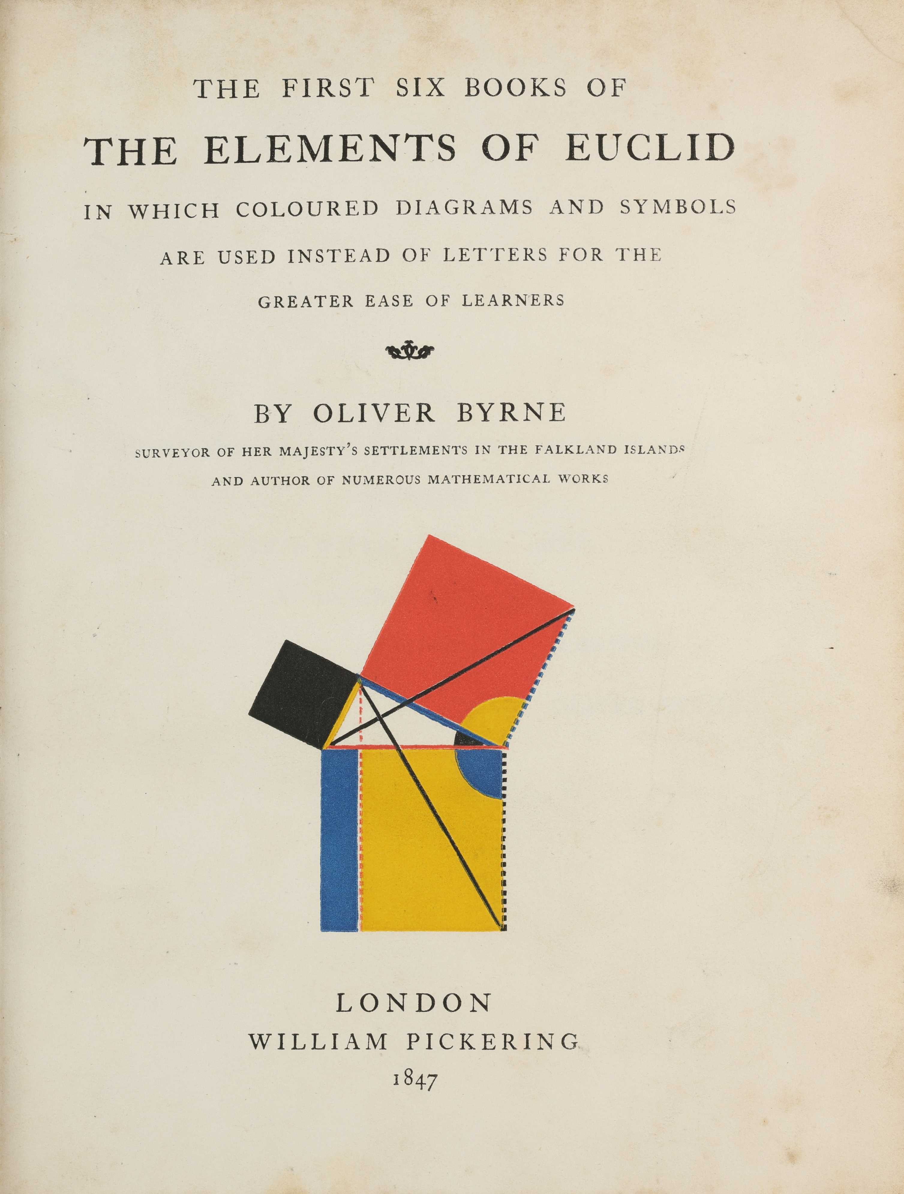
Figure 1: William Pickering, Title Page Illustration, The Elements of Euclid, 1847, London (https://publicdomainreview.org/collection/the-first-six-books-of-the-elements-of-euclid-1847/).
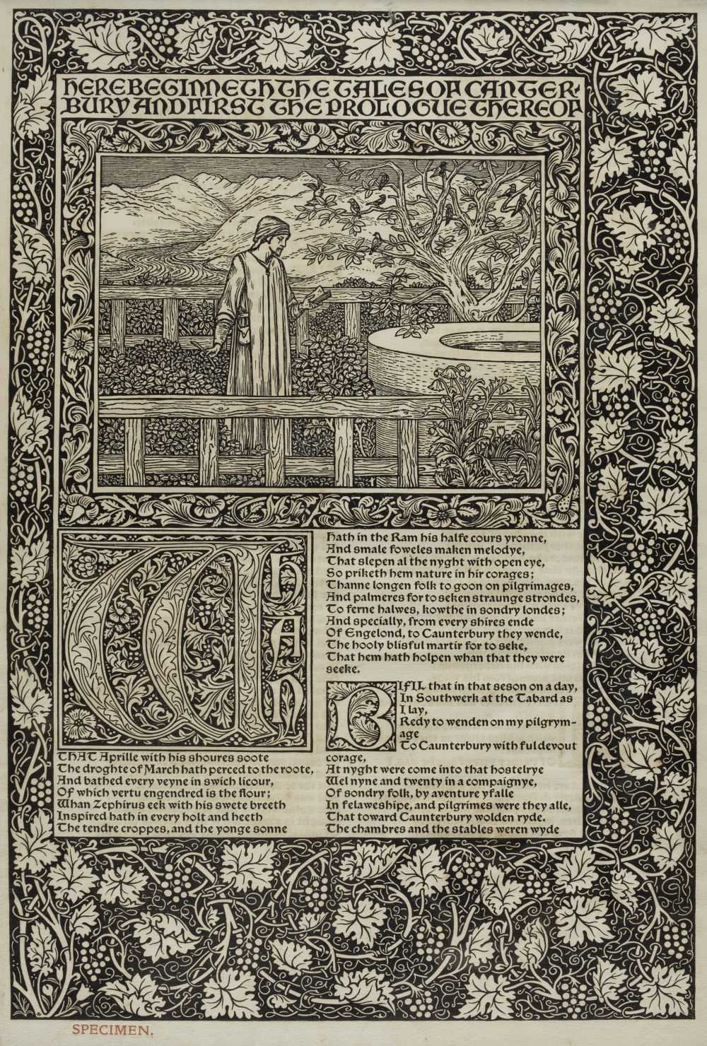
Figure 2: William Morris, Interior Page, The Works of Geoffrey Chaucer: Now Newly Imprinted, 1896, Houghton Library (https://hist1318.omeka.fas.harvard.edu/items/show/6).
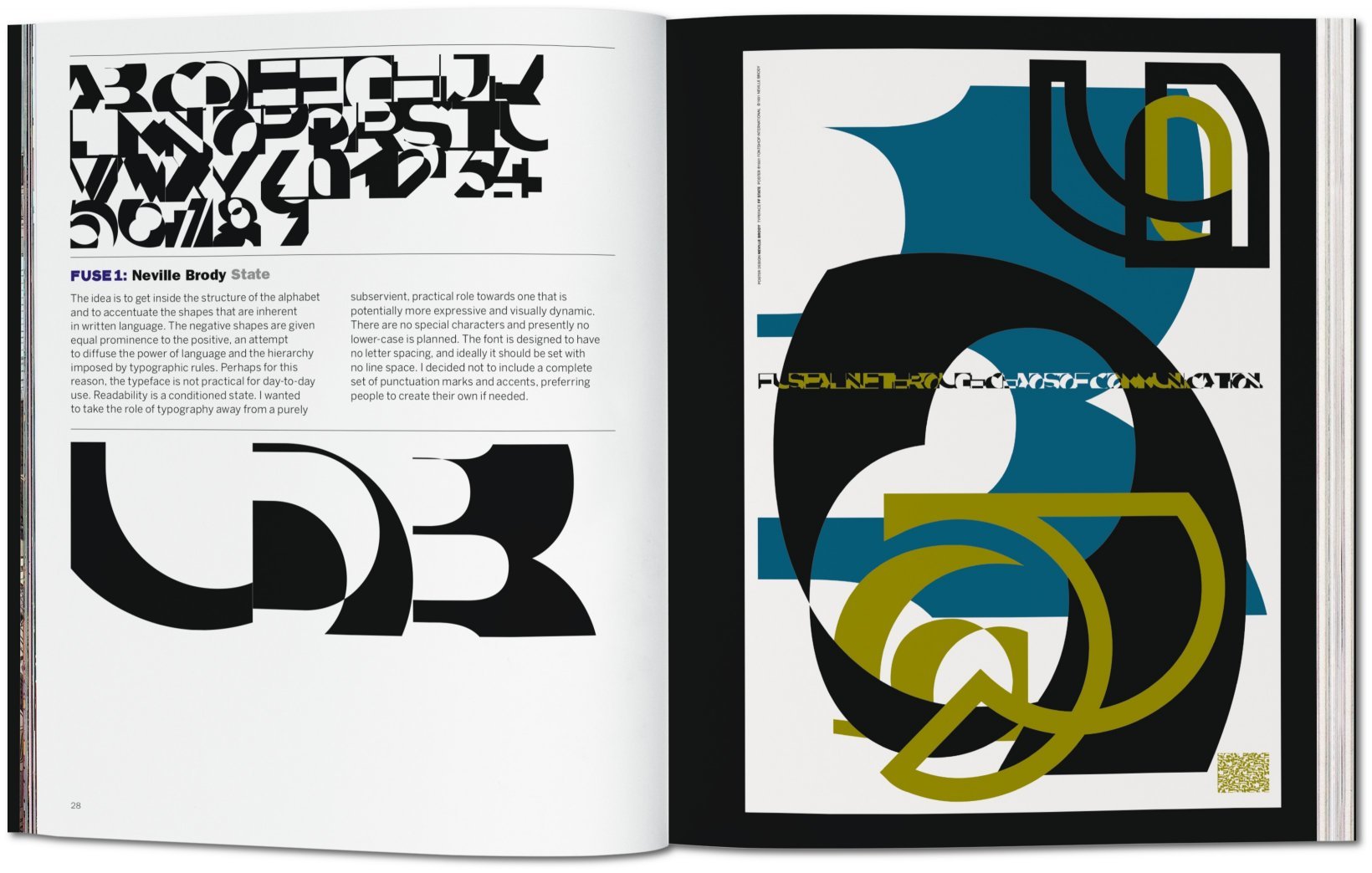
Figure 3: Neville Brody, Interior Spread, Fuse 1 - 20 from Invention to Antimatter ; Twenty Yearsof Fuse, 2012.
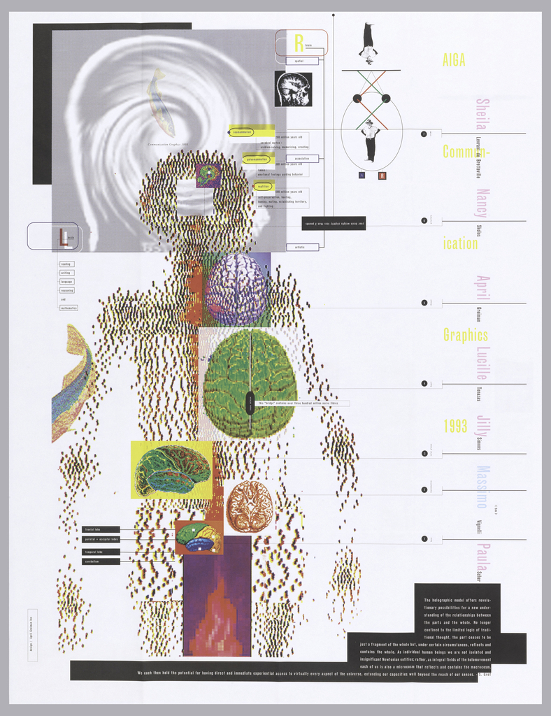
Figure 4: April Greiman, Poster for AIGA Communication Graphics: Holographic Model, 1993, 112.2 x 86.3 cm, Cooper Hewitt, Gift of Unknown Donor (https://collection.cooperhewitt.org/objects/18647569/).

Figure 5: Susan Kare, Bomb Icon, 1983, recreation by Jeremy Hlinak.
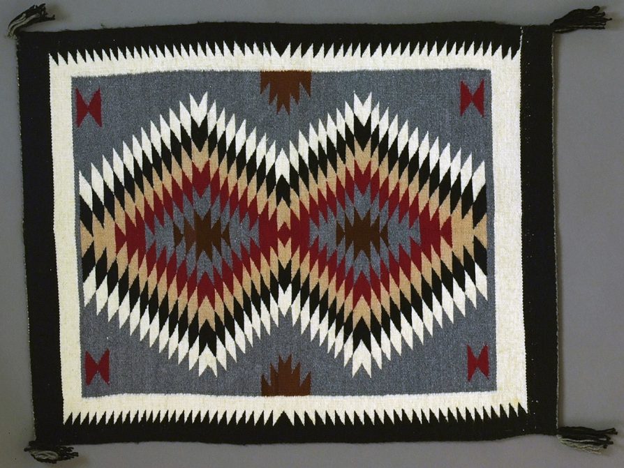
Figure 6: Navajo Weaving, c. 1970, wool on cotton warp, Warner Collection, UMMAA, Arizona (https://lsa.umich.edu/ummaa/news-events/all-news/200-objects-in-200-days/day-115--200-objects-in-200-days.html).
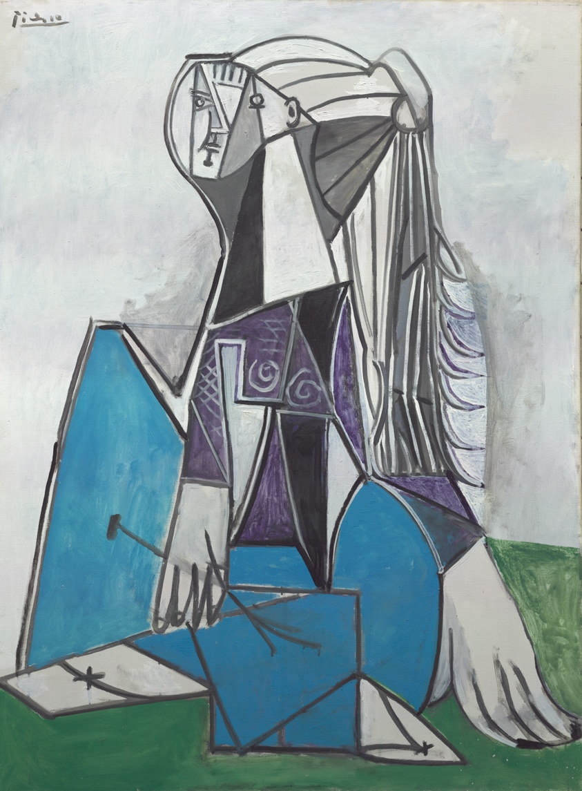
Figure 7: Pablo Picasso, Portrait of Sylvette David, 1954, oil on canvas, 130.7 × 97.2 cm, The Art Institute of Chicago, Chicago (https://www.artic.edu/artworks/84239/portrait-of-sylvette-david).
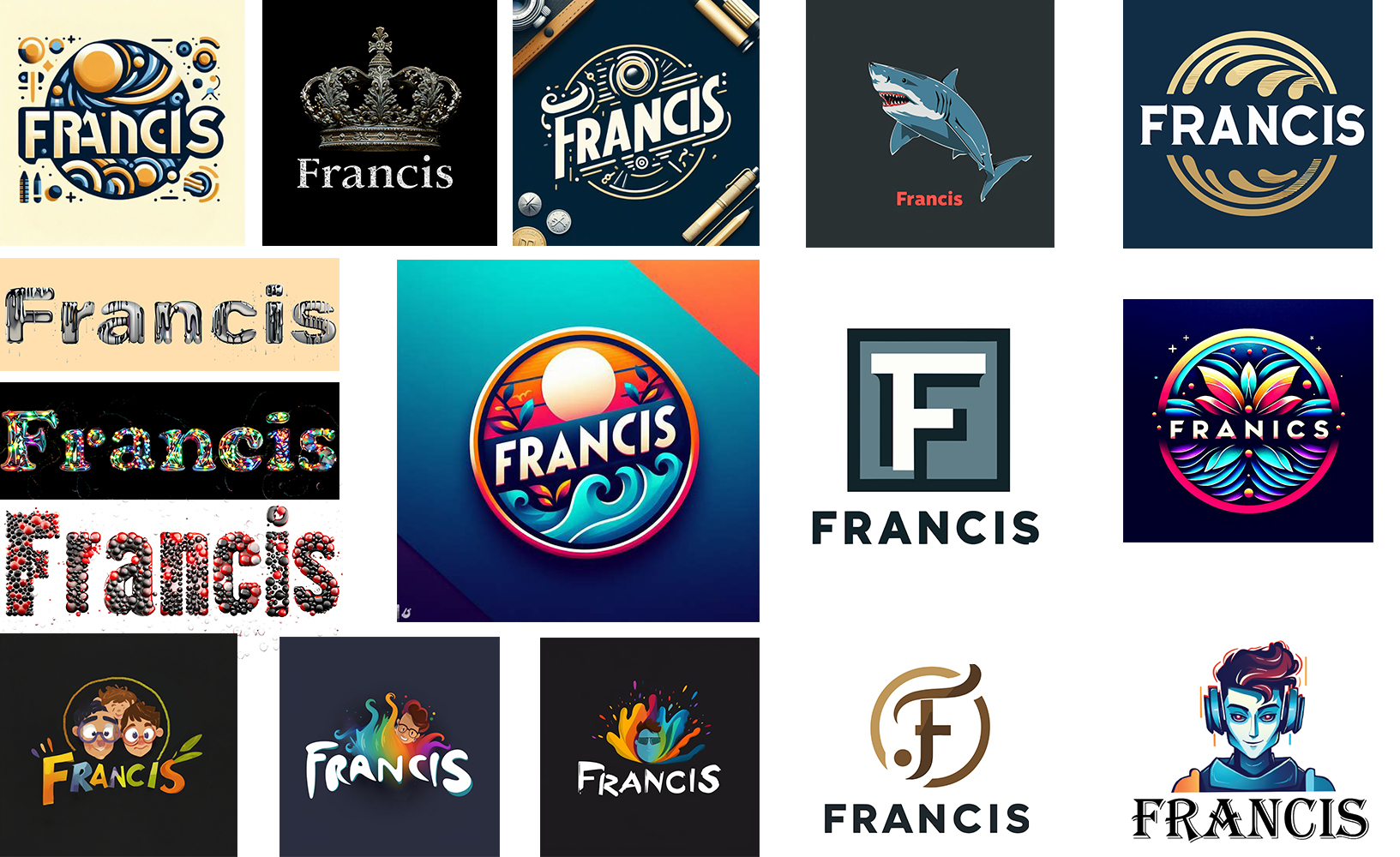
Figure 8: The Francis logo, 2023, ai-generated imagery.

igure 9: America’ s five-over-one architecture, 2023(https://www.alexmurrell.co.uk/articles/the-age-of-average).
* Forgive the formatting. Will do my best.
Abako, Gideon. “How Social Media Information Overload Can Affect Mental Health.” LinkedIn,19 Mar. 2023, www.linkedin.com/pulse/how-social-media-information-overload-can-affect-mental-gideon-abako/.
Adams, Sean. “Graphic Design Tools Before Photoshop | Photoshop 25th Anniversary. ”LinkedIn Learning, YouTube, 26 Feb. 2015, ww.youtube.com/watch?v=O-XrRQf7BPM.“
Adobe Express.” Wikipedia, Wikimedia Foundation, 26 Dec. 2023, http://en.wikipedia.org/wiki/Adobe_Express.
Allard, Ken. “Decline of the Travel Agency.” Medium, Medium, 29 Sept. 2017, medium.com/@KenAllard/the-decline-of-the-travel-agency-cb534c5a166f.
Bakx, Kyle. CBCnews, CBC/Radio Canada, 29 Jan. 2023, www.cbc.ca/amp/1.6728613.
Benjamin, Walter. The Work of Art in the Age of Mechanical Reproduction. Translated by J. A.Underwood, Penguin Books, 2008.
Brody, Neville, and Jon Wozencroft. Fuse 1-20: From Invention to Antimatter: Twenty Years ofFuse. Taschen, 2012.
Carvell, Nick. “GQ Savile Row Guide: Norton & Sons.” British GQ, British GQ, 20 Feb. 2018, www.gq-magazine.co.uk/article/norton-and-sons-savile-row-tailor.
Davis, Meredith. Graphic Design Theory. Thames & Hudson, 2012.
Draplin, Aaron. Received by Jeremy Hlinak. 26 October 2023. Email Interview.
Font of the Year 2024 | Fiverr Logo Maker, www.fiverr.com/logo-maker/font-of-the-year-2024.
Gluckin, Tzvi. “Divine Obsession: 5 High-End Acoustic Guitar Builders.” Premier Guitar, 12 July 2021, www.premierguitar.com/gear/best-acoustic-guitar-luthiers.
Heller, Steven. and Pettit, E. (2001). 'The Impact of New Digital Technology on the Nature of Graphic Design: The Digital Designer'. http://www.andrewkelsall.com/the-impact-of-new-digital-technology-on-the-nature-of-graphic-design-the-digital-designer/
“Helvetica.” Directed by Gary Hustwit, performances by Massimo Vignelli, Tobias Frere-Jones, Michael Bierut, Paula Scher, Stefan Sagmeister, and David Carson, Veer, Swiss Dots, 2007.
Hoffman, Armin. Graphic Design Manual: Principles and Practices. Reinhold, 1965.
Horsham, Michael. Hello Human: A History of Visual Communication. Thames and Hudson, 2022.
Horton, Adrian. The Guardian, Guardian News and Media, http:.//amp.theguardian.com/music/2023/jul/12/vinyl-sales-us-report.
Kury, Abby. “7 Famous Logos That Cost a Fortune: Were They Worth It?” Brandripe, 13 July 2023, brandripe.com/blog/130/7-famous-logos-that-cost-a-fortune-were-they-worth-it.
Mali, Sneha. Cognitive Market Research. “Film Camera Market Size 2023 Will Be $277.91 USD Million and Will Reach to USD 387.27 Million by 2030.” Cognitive Market Research, 8 Nov. 2023, www.cognitivemarketresearch.com/film-camera-market-report.
“Material Design.” Wikipedia, Wikimedia Foundation, 21 Apr. 2024, en.wikipedia.org/wiki/Material_Design.
McCullough, Malcolm. Abstracting Craft: The Practiced Digital Hand. MIT Press, 1998.
McQuilling, Dave. “Why You’ll Hardly Find Any McLaren F1s on the Road.” SlashGear, SlashGear, 15 June 2022, www.slashgear.com/896896/why-youll-hardly-find-any-mclaren-f1s-on-the-road/.
Meggs, P. B. A History of Graphic Design. John Wiley, 1998.
“Merry Clayton.” Wikipedia, Wikimedia Foundation, 30 Dec. 2023, http://en.wikipedia.org/wiki/Merry_Clayton.
Morimoto, Danielle. "Opening Keynote." Adobe Max, 10 Oct. 2024. Conference.
Müller, Jens, and Julius Wiedemann. The History of Graphic Design: Vol.2 1960-Today. Taschen, 2019.
Müller-Brockmann, Josef. Grid Systems in Graphic Design: A Visual Communication Manual for Graphic Designers, Typographers and Three Dimensional Designers. Niggli, 2007.
Murrell, Alex. “The Age of Average.” Alex Murrell, Alex Murrell, 22 Oct. 2023, www.alexmurrell.co.uk/articles/the-age-of-average.
“Natasha Jen: ‘Design Thinking is Bullsh*t.’” YouTube, YouTube, 19 Mar. 2018, https://www.youtube.com/watch?v=_raleGrTdUg.
Pater, Ruben. Caps Lock: How Capitalism Took Hold of Graphic Design, and How to Escapef rom It. Valiz, 2022.
“Pete Goddard - Graphic Design in the Pre Digital Era.” Pete Goddard - Graphic Design in the Pre Digital Era, 1 Nov. 2017, petegoddard.pw/graphic-design-pre-digital-era.
Rand, Paul. Paul Rand: Design Form and Chaos. Yale University Press, 2017.
“Salon de Imperfectionism.” Wonzimer, www.wonzimer.com/salon-de-imperfectionism.
Sinopoli, Carla M. “Less than Perfect.” Less Than Perfect, exhibitions.kelsey.lsa.umich.edu/less-than-perfect/index.php.
“Steve Jobs’ Letter Explaining Apple’s Flash Distaste.” CNET, 29 Apr. 2010, www.cnet.com/culture/steve-jobs-letter-explaining-apples-flash-distaste/.
Tschichold, Jan. The New Typography. University of California Press, 2006.
Valicenti, Rick. Received by Jeremy Hlinak. 4 July 2023. Email Interview.
“Vinyl Revival.” Wikipedia, Wikimedia Foundation, 22 Dec. 2023, http://en.wikipedia.org/wiki/Vinyl_revival.
“Web Design.” Wikipedia, Wikimedia Foundation, 27 Mar. 2024, en.wikipedia.org/wiki/Web_design.
Webster, Garrick. “The Rise of Riso.” Communication Arts, 5 Jan. 2018, www.commarts.com/columns/the-rise-of-riso.
* Forgive the formatting. Will do my best.
Apple Releases Its Most Important Typeface in 20 Years - Fast Company, www.fastcompany.com/3038794/apple-releases-its-most-important-typeface-in-20-years.
Ashworth, Chris. Received by Jeremy Hlinak. 27 September 2023. Email Interview.
Banerjee, Nupur, et al. Changing the Perception of “Slow” in “Slow Design”, Savannah Collegeof Art and Design, eLearning, Savannah, Georgia, 2015.
Bantjes, Mirian. Received by Jeremy Hlinak. 12 August 2023. Email Interview.
Buzov, Nevio. Received by Jeremy Hlinak. 20 June 2023. Email Interview.
Carson, David. Design and Discovery. https://www.ted.com/talks/david_carson_design_and_discovery." Craft in Action: The Case for Graphic Designers to Start with Analog Methods." The Drum, https://www.thedrum.com/news/2018/07/17/craft-action-the-case-graphic-designers-start-with-analog-methods.
Cramsie, Patrick. The Story of Graphic Design: From the Invention of Writing to the Birth of Digital Design. British Library, 2010.
Crow, David. Visible Signs: An Introduction to Semiotics in the Visual Arts. Bloomsbury Visual Arts, 2018.
Downs. Is it a book, is it a screen, no it's…—graphics and the interface in electronic paper . Digital Creativity, 16(1), 31-42, 2005.
Engholm. Digital style history: the development of graphic design on the internet. Digital Creativity, 13(4), 193, 2002.
Gosling, Emily. "Dafi Kühne's Book True Print Shows How to Merge Analogue and Digital to Stunning Effect." Creative Boom, 24 Mar. 2017, https://www.creativeboom.com/features/dafi-kuhne-true-print/.
Lanier, Jennifer E., et al. Inspiration Or Theft?: Investigating how Millennial Graphic Design Students Seek Inspiration and Over-Appropriate the Works of Other Designers, Savannah College of Art and Design, Atlanta, Georgia, 2017.
Meggs, Philip. Ch 24 The Digital Revolution and Beyond. https://www.youtube.com/watch?v=vRYyXs2xsp0.
Skaja, Joel C., et al. Inspired Graphic Design: Rethinking the Influence of the Computer in the Graphic Design Industry, Savannah College of Art and Design, eLearning, Savannah,Georgia, 2017.
Shaughnessy, Adrian. How to Be a Graphic Designer, without Losing Your Soul. Princeton Architectural Press, 2010.
Willer, Marina. Keep looking for ideas in unusual places - Domestika Maestros. https://www.youtube.com/watch?v=GC2gh7FDe3I